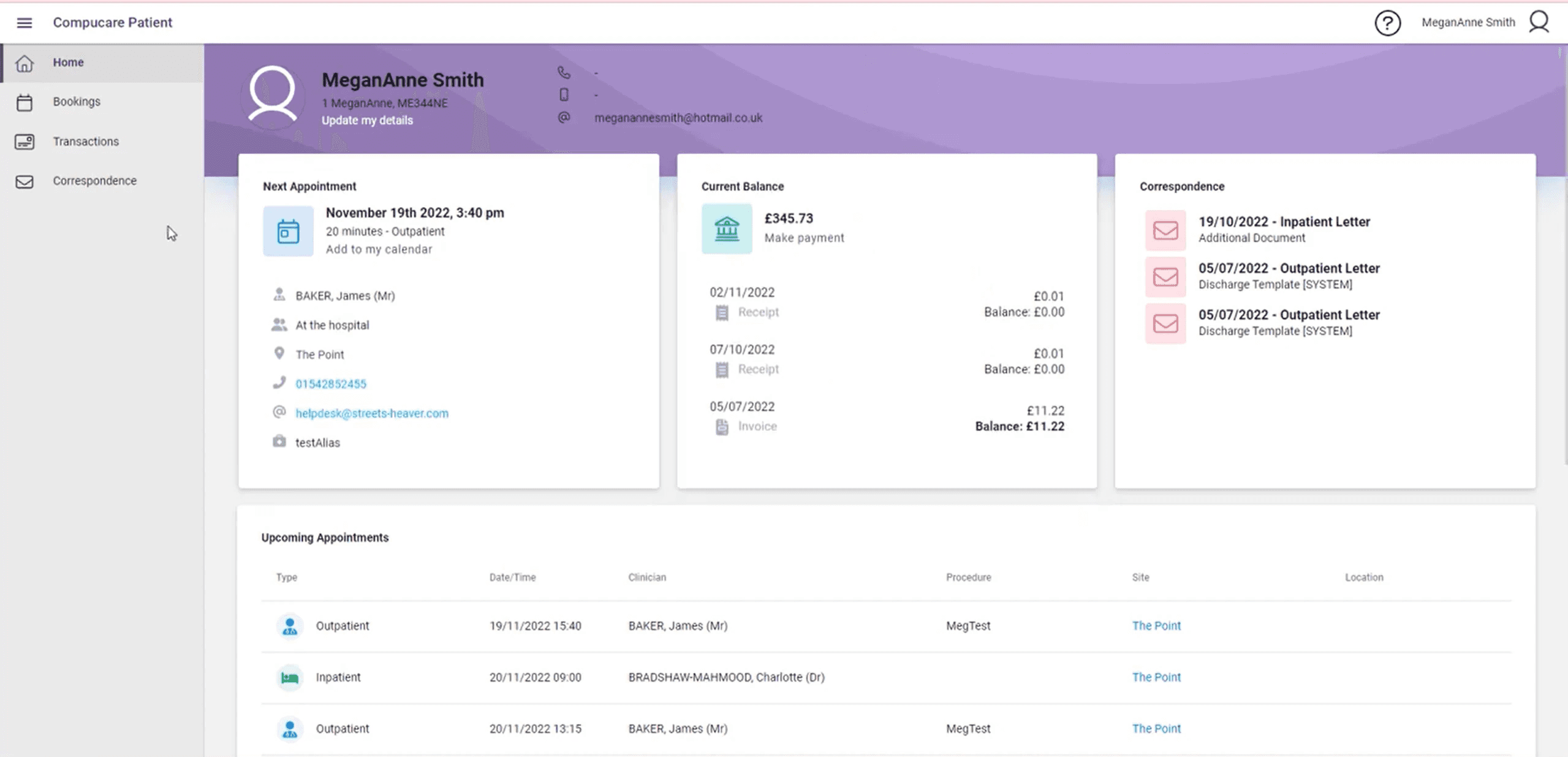
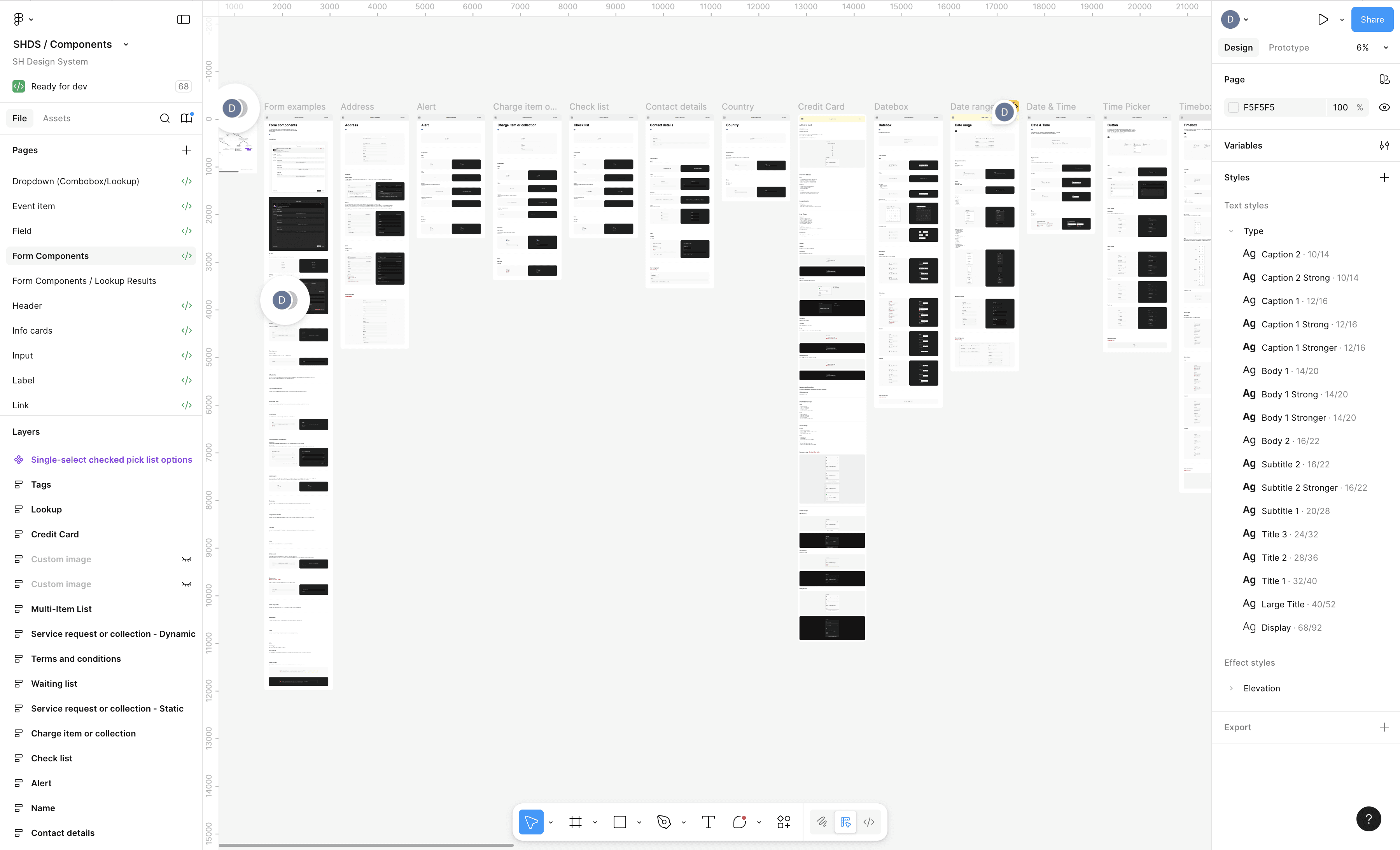
Images are limited due to contractual agreement
One system for faster, consistent product delivery
I built a shared design system and design ops layer for multi platform products, covering tokens, components, accessibility, and rituals, so designers and engineers ship consistent features faster with less friction.
My role
Product designer
Skills used
Design systems, information architecture, multi platform design, design ops, process design, facilitation, documentation, accessibility, stakeholder alignment
Duration
Ongoing, but 9 months from first audit to steady state adoption
Tools used
Figma, Storybook
At the Streets Heaver, design was an afterthought. Teams shipped features with inconsistent UI and created ad hoc patterns all while miscommunication meant efforts were doubled when duplicate components were made.
Visual and interaction inconsistency across products
Each team made local decisions on colours, spacing, and interaction
Buttons, inputs, and tables were unintentionally different between products
Delivery was slow and collaboration was noisy
Engineers had questions with no source of truth
Similar components were built from scratch in each repo
No standards for accessibility
Accessibility guidelines were in a static document rather than built into components
Focus states, keyboard support and aria labels varied between screens
Quality depended on the knowledge of the engineer rather than shared standards
Products audited and foundations defined
I started with a UI audit across all products, cataloging colours, type, spacing; all of the main tokens you would expect. Following this, all common inputs and components were documented and mapped out.
None of this was in a design tool (this was before the company started using Figma). All of these variables were found from disparate documents and live code.
SHUI (it didn't work)
I initially built a component library from scratch. Being new to both the company and product design, I felt pressure to demonstrate my capabilities both personally and professionally. This early design-engineering collaboration phase exposed several shortcomings. After a few weeks of engineers highlighting fundamental issues in my designs through ongoing discussions, I stepped back to reassess my approach.
Given the time constraints (after my first unsuccessful attempt) and the need for a robust solution, I built our component library on top of the Fluent UI 2 library. By starting with a proven base, I was able to focus on tailoring these components to align with our colours and visuals. The process unfolded in smoother and more considered stages:
Component Adaptation: I modified basic components from Fluent UI 2, ensuring they met our design needs and brand guidelines.
Workshop & Collaboration: I organised workshops with senior engineers to review the component library. This session not only validated my new approach but also set a foundation for future components using an atomic design methodology.
Documentation & System Building: Next, I expanded the scope by developing clear guidelines around typography, content design, ux patterns, and mobile patterns. I collaborated with the commercial and marketing teams to ensure our fonts, colours, and overall branding were consistent across all touchpoints. The final deliverables included several working Figma documents:
A comprehensive design system document.
Separate documents for desktop and mobile components.
Integration & Accessibility: To facilitate broader company access, I published the design system into Loop, ensuring that it was readily available for ongoing reference and updates. I’m also planning a Figma file revamp to better align the system with an upcoming TypeScript rewrite, addressing current clarity issues in the component library.
Collaboration & Process Optimisation
Creating this system was as much about building processes as it was about designing components. My initial version of the component library taught me the critical importance of detailed documentation. By running workshops with senior engineers and aligning with marketing and commercial teams, I established a workflow that ensured:
Clear Documentation: Every component came with comprehensive guidelines to minimise ambiguity for me and engineers.
Standardised Handoff: The system streamlined the transition from design to development, reducing time spent answering repetitive questions.
Scalability: The framework allowed for rapid creation and documentation of new components, ensuring consistency as new features were added across multiple products.
Outcome
The new design system has had a transformative impact:
Efficiency Gains: Every new design now follows established rules and templates, drastically reducing turnaround time for both design and development.
Onboarding: When we brought on a junior designer, they were quickly integrate into projects, using predefined templates that align with our overall system, leading to a more consistent product experience.
Enhanced Collaboration: With clearly defined components and processes, cross-functional teams experience fewer miscommunications, ensuring that design decisions translate effectively into code.
Lessons learned
Attention to Detail is Crucial: Detailed documentation not only speeds up engineering work but also streamlines the design process by preemptively addressing potential questions.
Continuous Learning: My journey involved overcoming a steep learning curve in understanding code, fundamental ux principles and accessibility, which has enabled me to replace outdated designs with more accessible, user and developer-friendly components.
If I Could Turn Back Time: Reflecting on the failure of the first component library iteration, I would take a more methodical and considered approach by thoroughly documenting our requirements and limitations, and by utilising preexisting components, patterns, and libraries to supplement and enhance my knowledge and to reduce unnecessary pixel pushing. I would also define and create design templates earlier to ensure consistency between other products.


